This article is suitable for those who understand the basics of CSS.
To change the styles for certain screen sizes of devices, you need to go through the following steps:
Using media queries allows you to determine that the user is using a small screen device (such as a smartphone) and show him a specific page layout.
The capabilities of media queries are not limited to identifying mobile devices, they can be used to create a responsive layout. Such a layout adjusts to the resolution of the monitor and browser window, changing, if necessary, the width of the layout, the number of columns, the size of images and text. Media queries limit the width of the layout, and when this value is reached (for example, by reducing the window size or when viewed on a device with the specified size), a different style is already applied.
1. Adding a CSS block
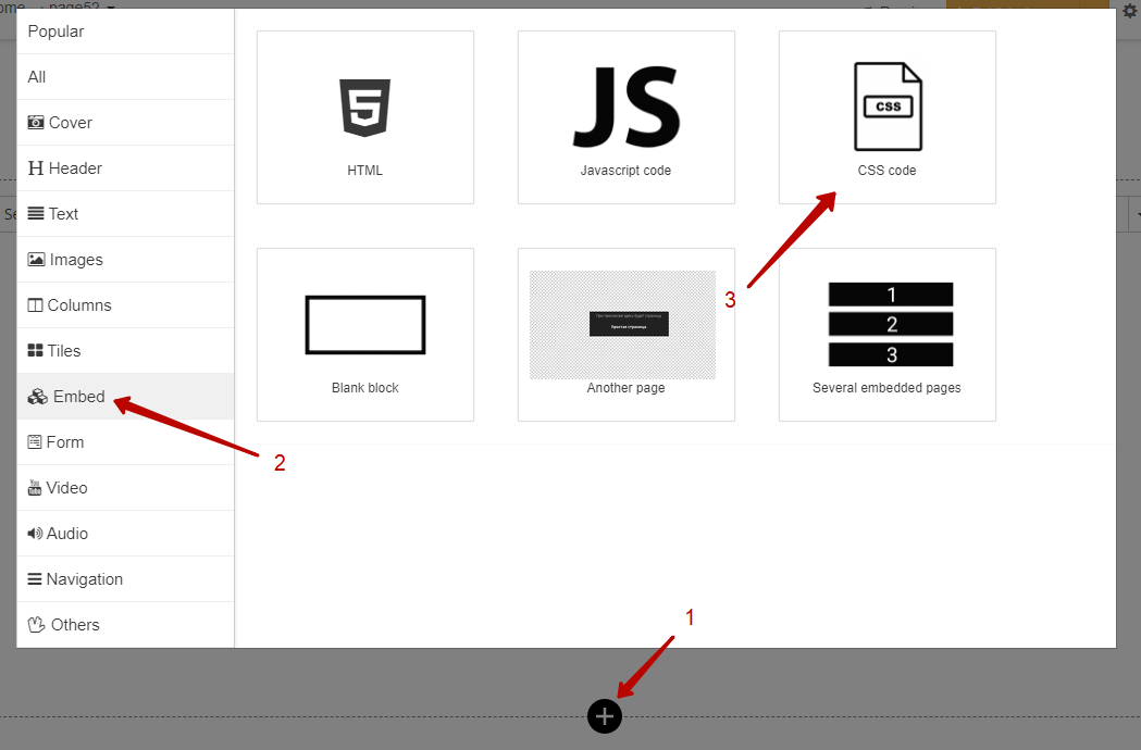
In order to create a CSS block, you need to:
Open the builder with block selection (1)
Select «Insert» (2)
Click on CSS block (3)
The result is the created block.

2. Create a media query
Media queries define the specifications of the device on which the document is displayed. The style is executed if the query returns true, in other words, the specified conditions are met.
All queries begin with the @media rule, followed by a condition that uses media types, boolean operators, and media queries.
To change styles for certain device screen sizes, you need to add the following lines to the created CSS block:
@media screen {

}
When we want to specify the desired screen width, for example, the landscape orientation of the IPhone 7 (768px), we need to supplement our media query:
(max-width) — is responsible for the maximum width of the device screen
@media screen and (max-width: 768px) {

}
When you need to change something on a specific screen size, you can supplement the current query:
(min-width) — is responsible for the minimum width of the device screen
@media screen and (min-width: 468px) and (max-width: 768px) {

}
https://www.mydevice.io/ — most sizes of different devices can be found on this website.
You need to check the CSS-width column.
3. Changing properties of elements
To change the properties of an element, for example, text, buttons, images, you need to become familiar with selectors and how to add your class to an element.
The article «Styling an Element with a Custom Class» can help with this.
The ability to change styles using media queries logically follows from understanding and using selectors.
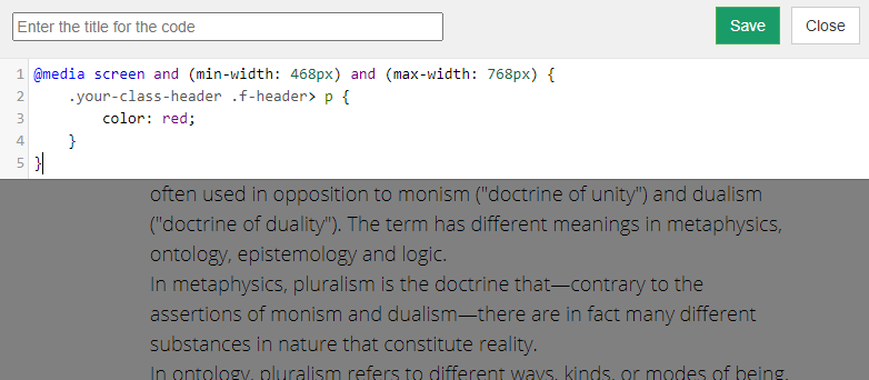
This example changes the color of the title to red when the page is viewed by the use of devices with screen widths from 468px to 768px.
@media screen and (min-width: 468px) and (max-width: 768px) {
    .your-class-header .f-header> p {
        color: red;
    }
}
Set the heading class using the article above and add the following code in the CSS block:

Code results:

We use technology such as cookies on our website to personalize content and ads, provide media features, and analyze our traffic. By using the GetCourse website you agree with our Privacy Policy and Cookies Policy.

please authorize