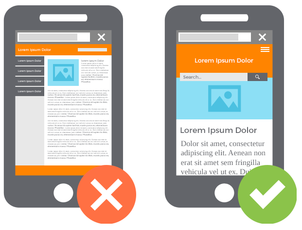
GetCourse page builder allows you to create and edit website pages tailored to your requirements and your taste. But sometimes the landing page on mobile devices is not displayed in the way you expected.
In such a situation, first of all, it is worth checking the text. Perhaps, at the time when you pasted it, the text “sticked together” into large blocks due to non-breaking spaces. Removing non-breaking spaces allows the page to display correctly.
Additionally, you can change blocks specifically for mobile devices by setting the block visibility.
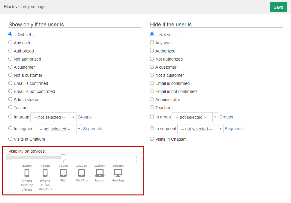
Visibility on devices - the block will be visible (or hidden) depending on the screen resolution of the device from which the user entered the page.
You can choose the following size:
- less than 320px
- 320px (iPhone X/XS/6/7/8/SE)
- 410px (iPhone XR/XS Max /6, 7, 8 Plus)
- 760px (iPad)
- 1020px (iPad Pro, common iPad horizontally)
- 1200px (laptops)
- 1600px (large monitors)
- more than 1600px

Let's indicate in the settings that the block is available only from devices with a resolution of up to 760px, for example, an iPhone. If the user enters the page using a device where the screen resolution is greater than the specified one, for example, a laptop or personal computer, the block will not be displayed to him.
Adapting texts
It is known that when viewing websites using mobile devices, users read less by scrolling through long texts.
Therefore, especially for mobile devices, the text requires elaboration; it is necessary to hide less important content by leaving the most valuable.
And it is with the help of setting the visibility of blocks that we change the content for different types of devices.
Pay attention to the font for texts visible on mobile devices only. The font should not be too small or too large, the content on the website should be readable.
The user does not have to take additional actions to read the text.
Use catchy headings and phrases.
Additionally, add an image or an animated fragment to the text, this will help to delay the user's attention and enhance understanding of the text.

Optimizing images
When creating the landing page, we made a very beautiful cover and on a personal computer it looks great. BUT! when viewed from a mobile device, the page loads for a long time, because a “heavy weight” picture with high resolution and clarity was used, not every device and mobile Internet speed will allow you to download the image instantly. The page will display an “empty” place while loading.
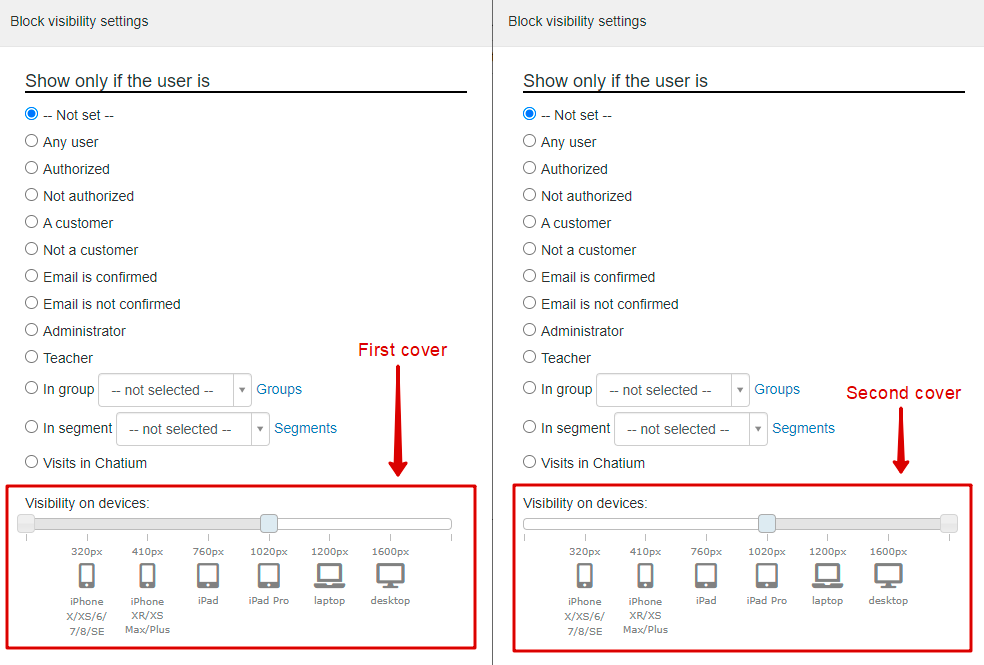
To avoid this, you need to make at least two blocks, one for viewing on a personal computer, the second for mobile devices. The third block is also possible - for viewing from tablets. And for each block, upload your own image: for a personal computer, you can use higher resolution images, for mobile ones - “lighter” images so that they are downloaded by the user instantly.


To view the display of the website on different devices, you can use the adaptivator service or the developer mode of your browser.
Learn about the additional features of manual adaptation of the mobile version of the page in the next article.
We use technology such as cookies on our website to personalize content and ads, provide media features, and analyze our traffic. By using the GetCourse website you agree with our Privacy Policy and Cookies Policy.

please authorize