The standard block is the base block in the GetCourse page builder. Depending on your tasks, a block may consist of various elements: text, image, button, etc.
You can add a standard block to the page if you select any of the following blocks in the “Text” section:
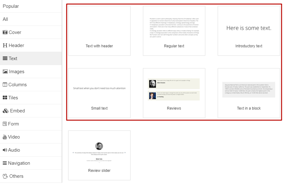
In addition to text blocks, standard blocks are presented on the page in different categories:
- cover,
- regular header
- super-big headline
- big headline
- big picture
- button,
- timer,
- Facebook comment feed.
Any of these blocks can be filled with the required content by removing and adding elements in the block settings:
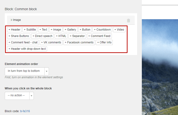
You can customize the appearance of the block in the “Style” tab:
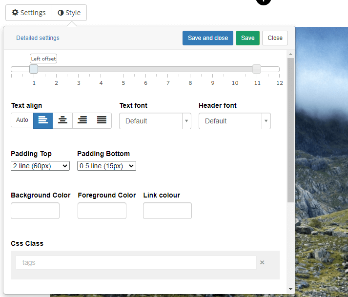
Style Settings
Indents - left and right:
The width of the screen is conditionally divided into 12 equal parts, and the indentation allows you to select the area of the screen in which the elements will be located.
Text alignment:
You can align the text to the left, center, right, or by width.
Indents - above and below:
For block elements, you can set the indentation above and below, and select colors for the background and text.
You can also select a cover, make it static or scrolling, add a background video.
Container:
If you check the box 'Show container', then the elements of the block will be enclosed in a frame with indents. The container can be configured, you can set borders and choose a style for them, change the indents inside the container.
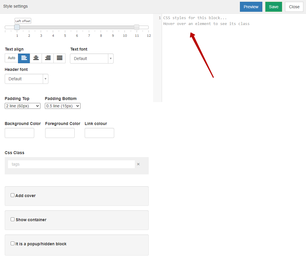
Advanced control of block parameters is available via the 'Detailed settings' button; those who wish can customize their styles using CSS:
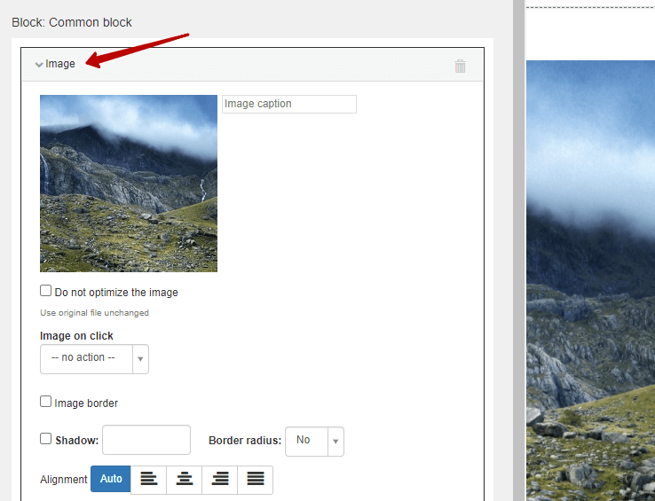
Each element of the standard block can be further customized, individual indents and alignment can be set, as well as other settings:
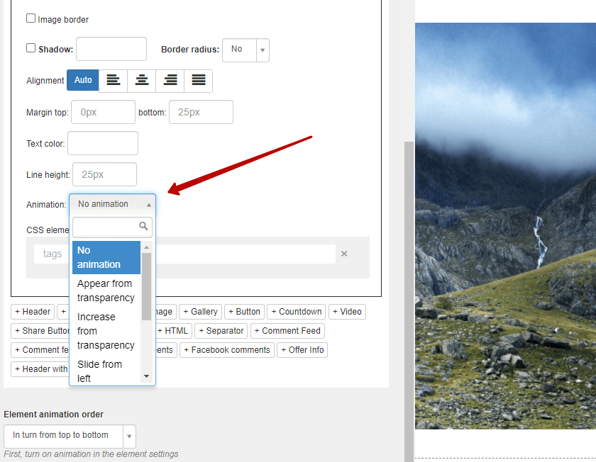
For each element in the standard block, you can configure the visual display using animation.
You can choose one of several available animation options:
- Fade in out of transparency
- Enlargement out of transparency
- Da transparency on the left
- Rolling in from the left out of transparency
- etc.
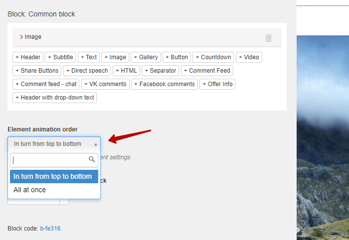
If there are several animated elements, you can configure the order in which they appear:
Below you can see with certain examples how the animation is displayed:

Appear from transparency

Slide from left

Slide from right
For buttons and images, you can add a shadow and adjust the rounding of corners:
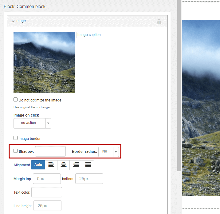
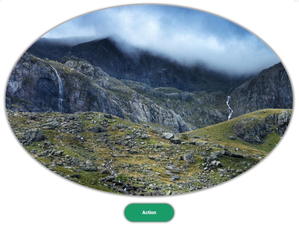
Image and button with shadow and rounded corners
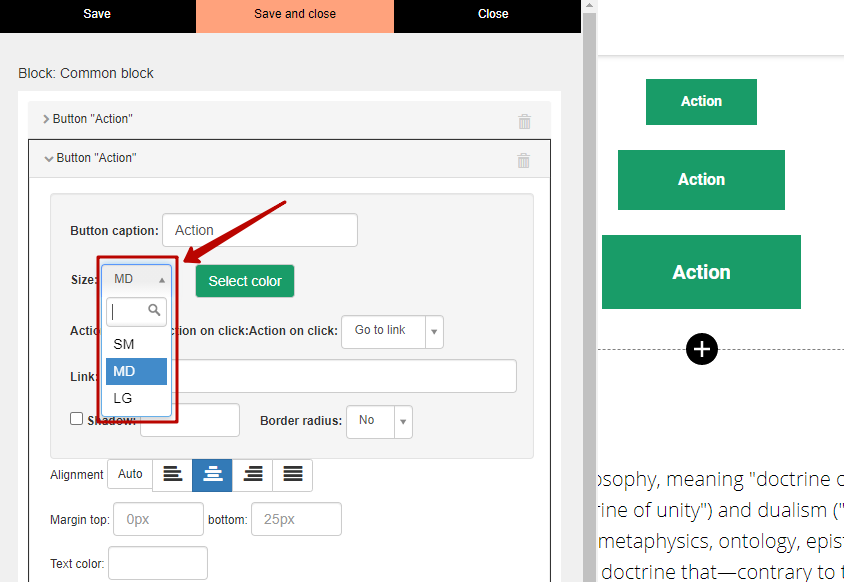
For buttons, it is possible to set their size - small, medium, large:
We use technology such as cookies on our website to personalize content and ads, provide media features, and analyze our traffic. By using the GetCourse website you agree with our Privacy Policy and Cookies Policy.

please authorize